Control Chart in Lean Six Sigma

Introduction
In Lean Six Sigma, a control chart is a fundamental statistical tool used to monitor process performance over time and ensure that improvements are sustained. It belongs primarily to the Control phase of DMAIC, where the focus is on maintaining process stability and preventing regression after improvements have been implemented.
A control chart helps distinguish between normal process variation and abnormal variation that requires investigation and corrective action.
What Is a Control Chart?
A control chart is a time-ordered graphical display of process data with statistically determined limits. It answers a critical question:
Is the process stable and predictable, or is something unusual happening?
A typical control chart consists of:
Center Line (CL) – the process average or mean
Upper Control Limit (UCL) – upper boundary of expected variation
Lower Control Limit (LCL) – lower boundary of expected variation
Plotted data points over time
These limits are not specification limits; they are calculated from the process data itself.
Purpose of Control Charts in Lean Six Sigma
Control charts support Lean Six Sigma objectives by:
Detecting process instability
Identifying special cause variation
Preventing defects before they occur
Sustaining gains achieved during improvement
Enabling data-driven decision making
They shift organizations from reactive firefighting to proactive process control.
Types of Variation
Understanding variation is central to control charts.
1. Common Cause Variation
Inherent to the process
Predictable and random
Requires process redesign to improve
2. Special Cause Variation
Due to unusual or assignable factors
Unpredictable
Requires immediate investigation and correction
Control charts help separate these two types clearly.
Types of Control Charts
Control charts are chosen based on data type and sample size.
A. Variable Data Charts (Continuous data)
Used when measurements are numerical.
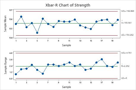
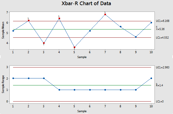
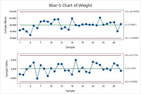
X̄ – R Chart: Mean and range (small samples)
X̄ – S Chart: Mean and standard deviation (large samples)
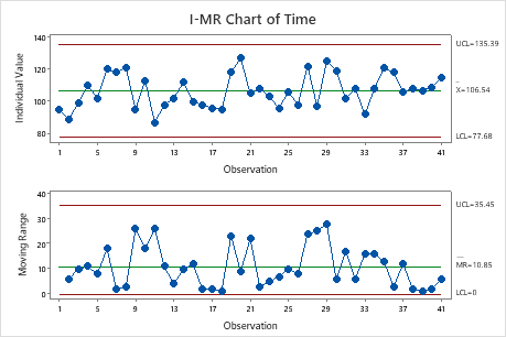
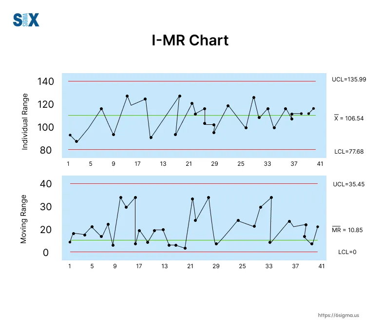
I–MR Chart: Individual values and moving range
B. Attribute Data Charts (Discrete data)
Used when data are counts or proportions.
P Chart: Proportion defective
NP Chart: Number of defectives
C Chart: Count of defects
U Chart: Defects per unit
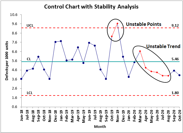
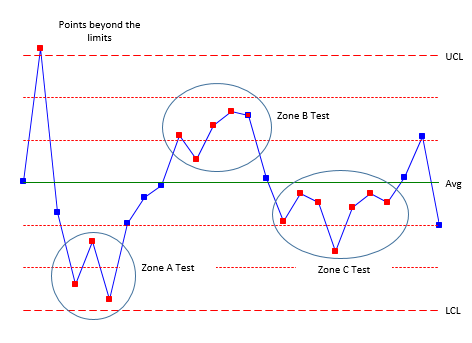
Control Chart Rules (Signals of Trouble)
A process may be out of control if:
A point falls outside UCL or LCL
Seven or more points trend upward or downward
Seven consecutive points lie on one side of the center line
Cyclical or repeating patterns appear
These rules help identify hidden instability even when points are within limits.
Role of Control Charts in DMAIC
| DMAIC Phase | Role of Control Chart |
|---|---|
| Define | Understand customer requirements |
| Measure | Establish baseline performance |
| Analyze | Identify variation patterns |
| Improve | Validate improvement effectiveness |
| Control | Monitor and sustain gains |
Control charts are most critical in the Control phase, where they act as an early warning system.
Benefits of Using Control Charts
Reduces defects and rework
Improves process predictability
Enhances customer satisfaction
Supports standardization
Builds a culture of continuous improvement
Common Mistakes to Avoid
Confusing control limits with specification limits
Reacting to every data point (overcontrol)
Using the wrong type of chart
Ignoring patterns and trends
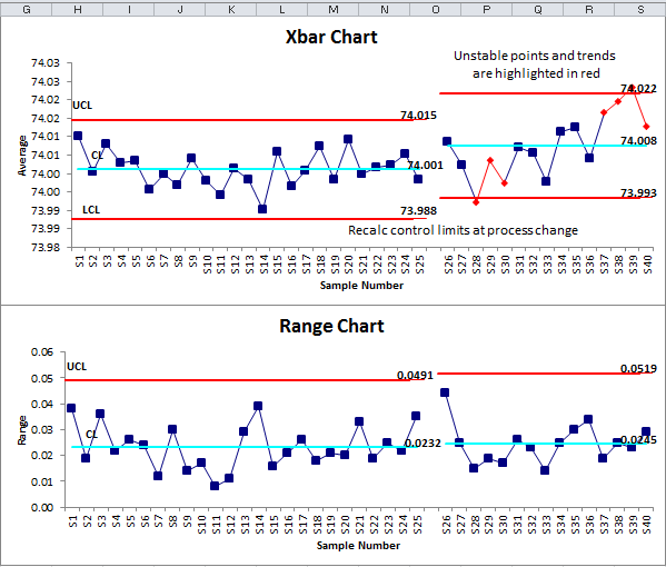
Failing to update charts after process changes
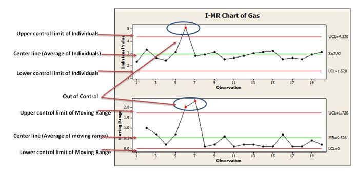
What happens when a point exceeds UCL or falls below LCL?
Let’s understand this with clear, practical examples 👇

Example 1: Point Exceeds UCL (Upper Control Limit)
Scenario
You are monitoring call handling time in a customer support process using an I–MR control chart.
Center Line (CL) = 5 minutes
UCL = 8 minutes
LCL = 2 minutes
What happened?
On Tuesday, the handling time recorded is 11 minutes, which is above the UCL.
Meaning
✔ This is special cause variation
✔ The process is out of statistical control
✔ Something unusual has occurred
Possible reasons
New employee handling calls
System outage or slow application
Very complex customer issue
No standard work followed
New employee handling calls
System outage or slow application
Very complex customer issue
No standard work followed
Action required
Stop and investigate immediately
Identify the root cause
Fix the issue
Prevent recurrence
🔴 Key point: A single point above UCL is a strong signal that the process behavior has changed.
Stop and investigate immediately
Identify the root cause
Fix the issue
Prevent recurrence
🔴 Key point: A single point above UCL is a strong signal that the process behavior has changed.
Example 2: Point Below LCL (Not Meeting LCL)
Scenario
You are monitoring fill volume in a bottling process.
CL = 500 ml
UCL = 520 ml
LCL = 480 ml
What happened?
One bottle shows 460 ml, which is below the LCL.
Meaning
✔ This is also special cause variation
✔ The process is out of control
✔ Customer dissatisfaction or defect risk
Possible reasons
Machine calibration issue
Valve blockage
Pressure fluctuation
Operator error
Machine calibration issue
Valve blockage
Pressure fluctuation
Operator error
Action required
Quarantine affected products
Check machine settings
Recalibrate equipment
Resume production only after stability
🔴 Key point: A point below LCL is just as serious as exceeding UCL.
Quarantine affected products
Check machine settings
Recalibrate equipment
Resume production only after stability
🔴 Key point: A point below LCL is just as serious as exceeding UCL.
Important Clarification (Very Common Confusion)
Control Limits vs Specification Limits
| Control Limits | Specification Limits |
|---|---|
| Based on process data | Based on customer requirement |
| Show process stability | Show acceptability |
| Used for monitoring | Used for inspection |
👉 A point within spec but outside control limits still needs investigation.
Simple Rule to Remember 🧠
Above UCL → Process behaving unusually high
Below LCL → Process behaving unusually low
Either case → ❌ Process is out of control
Above UCL → Process behaving unusually high
Below LCL → Process behaving unusually low
Either case → ❌ Process is out of control
Real-Life Analogy 🚗
Imagine driving a car:
Speed limit = Control limits
Suddenly you hit 140 km/h → exceeds UCL
Suddenly engine drops to 20 km/h → below LCL
Both are dangerous and need immediate action.
Lean Six Sigma Mindset
Do not adjust the process for normal variation.
Always investigate special cause variation.
Do not adjust the process for normal variation.
Always investigate special cause variation.
USL (Upper Specification Limit): The maximum acceptable value allowed by the customer or design
LSL (Lower Specification Limit): The minimum acceptable value allowed by the customer or design
Example 1: Manufacturing (Easy to visualize)
Scenario – Shaft Diameter
-
Required diameter = 10 mm ± 0.5 mm
Term Value USL 10.5 mm LSL 9.5 mm
Required diameter = 10 mm ± 0.5 mm
| Term | Value |
|---|---|
| USL | 10.5 mm |
| LSL | 9.5 mm |
-
10.3 mm → ✅ Acceptable (Average)
-
9.4 mm → ❌ Defect (below LSL)
-
10.6 mm → ❌ Defect (above USL)
Conclusion
Control charts are the heartbeat of Lean Six Sigma control. They transform raw data into meaningful insight, enabling organizations to maintain stable, efficient, and high-quality processes. Without control charts, improvements are temporary; with them, excellence becomes sustainable.
“You cannot improve what you do not measure, and you cannot sustain what you do not control.”
Comments
Post a Comment